Case study
Enhancing the Loan Borrower Onboarding Experience
How we redesigned Mutual's application flow to mitigate the impact of a strict credit policy, reducing drop-offs and recovering customers.
Client
Industry
Year
Status
Overview
The Scenario: Macroeconomic adaptation in a P2P fintech
Mutual is a credit and investment fintech that started off with the peer-to-peer (P2P) lending model, directly connecting investors to individuals seeking capital. As the business model matured, the platform expanded its operations into multiple products, including personal loans, solutions for micro and small enterprises, and solar energy financing. This diversification required a robust design ecosystem, where I acted as a Product Designer leading critical fronts such as Mutual Credit, Mutual Invest, and the creation of their first Design System. This case study focuses specifically on Mutual Credit during the year 2020. In the first half of that year, the outbreak of the Covid-19 pandemic triggered a large increase in the demand for loans. At the same time, to contain the risks generated by the economic crisis, the fintech was forced to severely tighten its automated credit analysis criteria. Historically, Mutual's exclusive credit policy already operated with a restricted approval rate of 20%; however, with the new restrictions implemented in the second half of 2020, this indicator plummeted to an alarming 1.5%.
Problem
The Challenge: An exhaustive onboarding with 98.5% of rejection rate
The drastic change of the approval policy exposed a critical flaw in the user journey: the onboarding process was extremely exhaustive and bureaucratic. Borrowers faced a long questionnaire requiring dozens of sensitive personal details, only to be redirected to a generic rejection screen in 98.5% of cases. This combination caused a severe impact on the brand's digital reputation, dragging ratings down to an average of 2.6 stars on the Google Play and App Store, with reviews flooded with complaints from frustrated users.
In addition to that, the product efficiency was compromised by a very high abandonment rate: 38% of users dropped off before even completing the onboarding process. The flow lacked conditionals to make it smarter and mechanisms to engage and recover leads. The design challenge was not only simplifying screens but also mitigating the impact of rejection, rebuilding the brand's perception of value, and creating viable alternative pathways for rejected loan borrowers.
Solution
The Strategy: Intelligent information architecture, friction reduction, and business partnerships
Technical mapping, discovery, and friction investigation
We started the project by formulating hypotheses regarding the demographic profile, the exact moments of evasion, and the potential discomfort caused by specific questions. The action plan involved an interface audit, meticulous flow mapping, and both quantitative and qualitative research with borrowers.
We discovered that the original onboarding consisted of 32 linear screens, lacked any progress indicator, presented duplicate screens, and did not have any conditional logic, forcing users to answer questions that were irrelevant to their profile.
After that, we conducted a competitive benchmark with major players in the financial sector. We noted that while the overall volume of requirements was similar, competitors stood out through superior visual organization, explanatory introductory screens, conditional logic, and better rejection screens.
Reducing Friction and Enabling Data Persistence
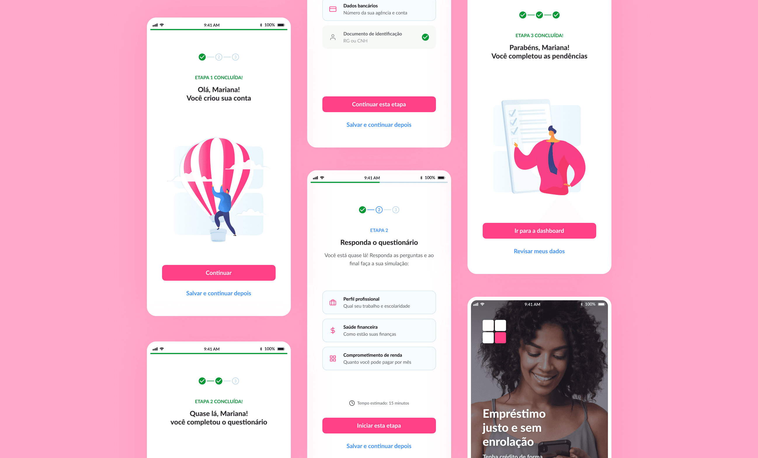
The macro restructuring divided the journey into three transparent phases: Onboarding, Questionnaire, and Simulation.
We introduced transition screens at the beginning of each phase, clearly stating the estimated time and which documents would be required, effectively reducing user anxiety.
We implemented a conditional logic tree to eliminate redundant questions and included a persistent visual progress indicator.
To mitigate daily usability friction, we inserted actionable contextual FAQs directly on screens where complex data was requested.
Aiming to resolve the 38% abandonment rate caused by interruptions, we implemented an automatic progress-saving feature, allowing borrowers to resume the application process exactly from where they left off.
A Humanized Rejection Experience and Partner Ecosystem
Knowing that the rejection rate would remain high due to risk policies, we completely redesigned the refusal experience. Instead of a short and frustrating message, the new screen began operating as a financial guidance hub, didactically explaining the factors that influence credit scores and providing actionable paths for users to improve their financial health.
We transformed the rejection into a business and conversion opportunity through two strategic fronts: we created a dedicated manual analysis flow to recover high-potential borderline borrowers and established a marketplace partner ecosystem.
Consequently, users rejected by Mutual's internal policy whose profiles fit other institutions were transparently routed, allowing them to find the credit they needed outside the fintech while starting their journey inside our app.
Outcome
The Impact: Conversion Optimization and Rescuing Institutional Reputation
The validation of the new flow was conducted through usability tests with 10 users aged between 18 and 52 who had never used the application, allowing us to accurately map and refine final edge cases before launch.
The results gathered after implementation demonstrated an immediate impact on both product and business metrics:
18% reduction in drop-off
during the onboarding funnel, validating the effectiveness of auto-saving and progress indicators
49% reduction in support tickets
during the onboarding funnel, validating the effectiveness of auto-saving and progress indicators
From 2.6 to 3.5 stars
In less than two months, the application's average rating rose on Google Play and App Store.
+1.8 points on NPS
A significant increase in the average NPS score among loan borrowers.
Final thoughts
Final Thoughts
Working within the Mutual Crédito ecosystem consolidated my understanding that the user experience must deliver value even when the product's final response is a negative one.
When business limitations or risk policies prevent the resolution of the customer's primary pain point, the designer's role is to create efficient alternative paths.
Transparency in processes involving sensitive data is not just a UX best practice, but an essential pillar for building and protecting a fintech's reputation.